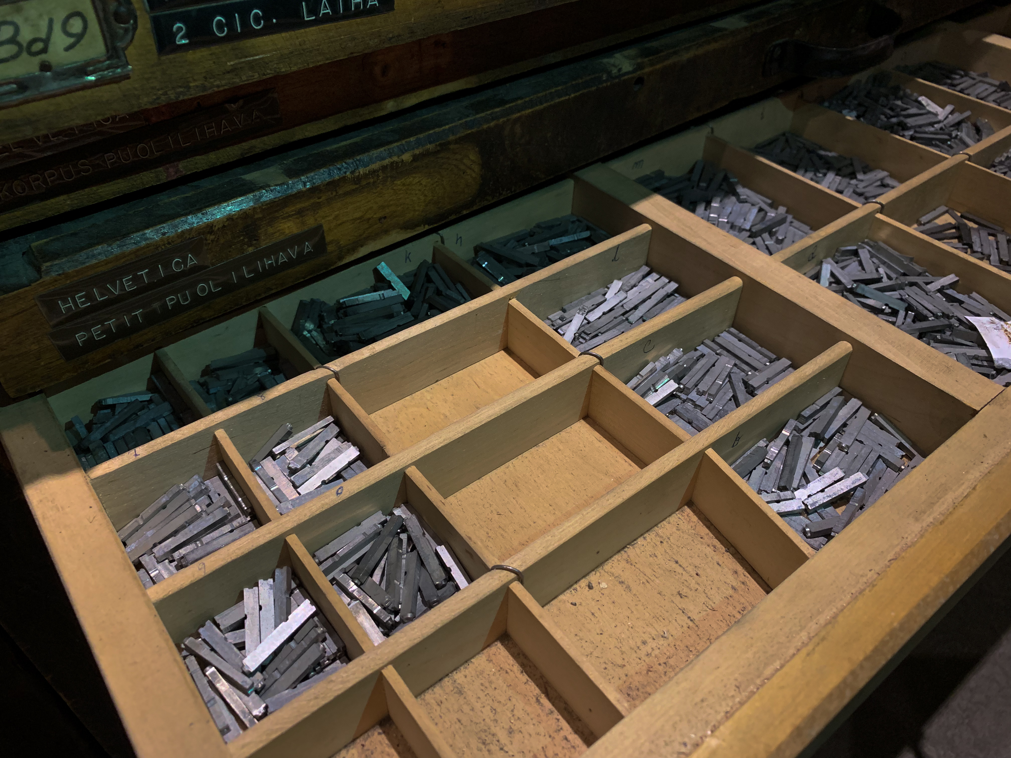
Nyt ollaan päästy käsiksi lehtitaittoon. Ihan ensimmäinen harjoitus taitto tehtiin yhdessä opettajan ohjaamana. Nyt ollaan päästy tekemään osaksi valmiista teksteistä ja kuvista taitosta oman näköistä. Meidän on itse pitänyt tehdä ja muokata kappaletyylit lehteä varten, mikä oli aluksi haastavaa. Se alkoi sujua paremmin jo muutaman kappaletyylin jälkeen, toki se vielä tuntuu hieman haastavalta.
–
Now we’ve got our hands on magazine lay outs. The first lay out we did together with the teacher. Now we’ve got to make our own lay out from partially ready texts and pictures. We had to design our own paragraph styles, which in the beginning was difficult. It started to go better already after few paragraph styles, even though it still feels a little difficult.


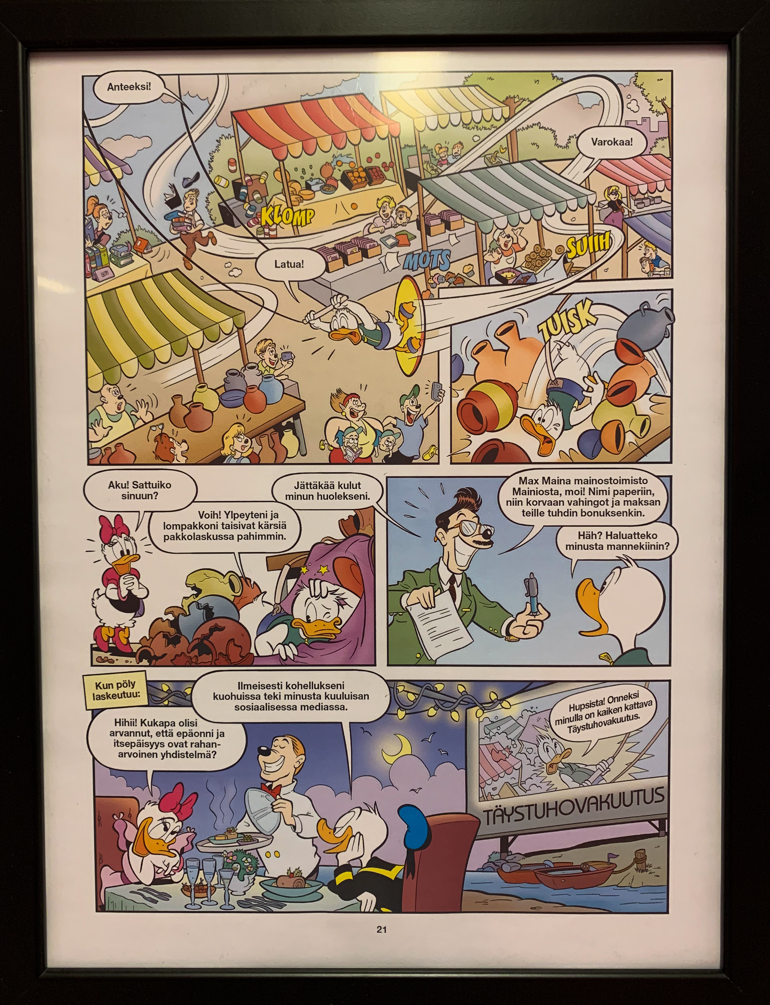
Master sivulle laitoin sivun värin, mikä helpotti työtäni. Myös master sivulla on sivunumero, lehden nimi ja minun nimi. Ingressissä on anfangi mikä on kooltaan 2 riviä ja yksi merkki. Ingressissä on myös sävytys takana. Leipäteksti on pistekooltaan 10.
–
To the master page I put the page color because it’s repeated in every page, so that made my work easier. Also in the master page there’s page number, the name of the magazine and my name. There’s a drop cap in the lead that’s two lines and one character size wise. Also in the lead there’s shading behind it. The body text is type size 10.

Sitaatit tein ingressin alatyypiksi, ilman anfangia. Lainausmerkit lisäsin erikseen, koska asetuksista en löytänyt vaihtoehtoa mistä ne olisi voinut lisätä.
Quotes I made as a subtype to the lead, without the drop cap. The quotation marks I added separately because I couldn’t find a setting for it.